Most digital products don’t fail dramatically. They don’t crash, corrupt data, or break in obvious ways. They fade. Usage slows. Engagement drops. Teams notice that new users take longer to get started, advanced features go untouched, and retention curves flatten earlier than expected. When this happens, the instinctive response is to add more value: new features, better messaging, richer dashboards. But very often, the problem isn’t that the product lacks capability. It’s that interacting with it feels like work.
At Expeed, we’ve learned that users rarely abandon products because something is missing. They leave because the experience demands too much mental effort. Each screen asks them to interpret, decide, remember, and verify. Individually, these moments seem small. Over time, they accumulate into fatigue. This is where cognitive load quietly shapes the fate of digital products and where simplicity becomes a serious business advantage rather than a design preference.
What Is Cognitive Load in UI Engineering?
Cognitive load refers to the amount of mental effort required to complete a task. In the context of UI engineering, it’s the thinking users must do to understand what’s happening, what they should do next, and whether their actions worked. Every unclear label, inconsistent layout, or unexpected interaction adds to this load. The user may still succeed, but the cost is paid in attention, confidence, and patience.
What makes cognitive load especially dangerous is its invisibility. Users don’t report it the way they report bugs. They don’t file tickets saying the interface made them hesitate too often. Instead, they disengage quietly. They delay tasks. They avoid certain features. Eventually, they stop returning. From the outside, it looks like a growth or adoption issue. In reality, it’s a cognitive one.
Why Explaining Features Does Not Reduce UI Complexity
Many products attempt to solve complexity by explaining more. Tooltips multiply. Onboarding tours stretch across multiple screens. Documentation grows heavier. While guidance is important, explanation alone does not reduce cognitive load. In some cases, it increases it by forcing users to read, remember, and recall instructions while performing tasks.
Effective UI engineering reduces the need for explanation in the first place. It relies on predictable patterns, visual hierarchy, and timely feedback so that users understand what to do without being told explicitly. When users must constantly rely on instructions to operate a product, it’s a sign that the interface itself is carrying too much cognitive weight.
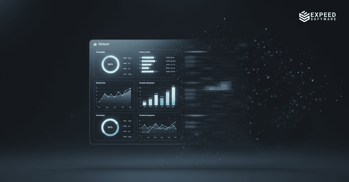
How Overloaded Dashboards Increase Cognitive Load
Consider a common scenario: a SaaS product where users land on a dashboard immediately after signing in. The dashboard is designed to showcase the product’s power. Metrics, charts, filters, actions, and settings are all visible at once. From a feature perspective, it’s impressive. From a cognitive perspective, it’s overwhelming.
A new user arrives with a simple goal: to complete one meaningful action and see value quickly. Instead, they are faced with dozens of choices. Which metric matters? Which action is safe? What’s required versus optional? The interface offers no clear starting point, so the user hesitates. That hesitation is cognitive load in action.
Experienced users may eventually adapt, but growth depends on new users crossing the initial threshold smoothly. When dashboards demand interpretation before action, time-to-value increases. Users take longer to succeed, feel less confident, and are more likely to drop off before forming a habit. The product doesn’t fail technically. It fails cognitively.
Managing Complexity in UI Design Without Oversimplifying
Some tasks are inherently complex. Financial workflows, logistics planning, data analysis, and configuration-heavy systems cannot be reduced to a single click. Attempting to oversimplify these tasks often results in loss of control or trust. The problem is not complexity itself, but how that complexity is presented.
Good UI engineering respects the reality of complex tasks while structuring them in a way that feels manageable. This means sequencing actions logically, grouping related information, and revealing details progressively rather than all at once. When users understand the shape of a task and where they are within it, they remain engaged even when the task itself requires effort.
Common UI Design Mistakes That Increase Cognitive Load
The most damaging cognitive load is the kind that serves no purpose. This includes inconsistent navigation patterns, screens that change layout unexpectedly, actions that produce no visible response, and labels that require interpretation. These issues don’t help users achieve their goals. They simply make the interface harder to use.
Over time, this unnecessary strain teaches users to be cautious. They double-check actions. They avoid exploring unfamiliar areas. They hesitate before clicking. Each of these behaviors slows down interaction and reduces perceived usability. From a business perspective, this translates into lower feature adoption and increased reliance on support.
Productive vs. Unnecessary Cognitive Effort in UX
Not all thinking should be eliminated. Some cognitive effort is productive. When users learn how a product behaves, build mental models, and gain confidence through consistent feedback, they become faster and more independent over time. This kind of learning strengthens engagement rather than draining it.
The role of UI engineering is to shift effort away from interpretation and toward understanding. Clear progress indicators, immediate confirmation of actions, and stable interaction patterns allow users to invest mental energy in meaningful tasks instead of deciphering the interface. Products that achieve this feel intuitive, even when they are powerful.
Why Simple User Interfaces Improve Product Adoption
Simplicity is often misunderstood as minimalism or lack of depth. In reality, simplicity is about reducing friction at decision points. When users can quickly understand what matters, what’s optional, and what happens next, they move through workflows with confidence. That confidence drives usage.
Simple interfaces shorten the path to value. Users reach successful outcomes faster, which increases the likelihood that they will return. They also make fewer errors, reducing frustration and support overhead. Over time, these effects compound. Retention improves. Support costs decrease. Expansion becomes easier because users are already comfortable navigating the product.
How UI Simplicity Drives SaaS Growth
Growth depends on repetition. Users must perform key actions often enough for habits to form. Cognitive load interferes with this process. When each interaction requires conscious effort, repetition feels draining. Users postpone tasks or abandon them altogether.
By contrast, interfaces that feel effortless encourage frequent use. Tasks become routine rather than demanding. This is where simplicity acts as a multiplier. It doesn’t just improve usability; it increases the frequency and depth of engagement. Products that are easy to use are used more often, and usage is the foundation of sustainable growth.
The Psychological Impact of Perceived Performance in UI
Perceived performance plays a significant role in cognitive load. When users click a button and nothing happens immediately, uncertainty sets in. They wonder whether the action worked, whether they should retry, or whether something went wrong. This uncertainty increases mental effort, even if the system is technically functioning correctly.
Visual feedback like loaders, disabled states, and confirmations reassures users that the system is responding. These elements are not decorative. They answer critical questions at the right moment. By reducing uncertainty, they lower cognitive strain and make the product feel faster and more reliable.
The Business Impact of Poor UI and High Cognitive Load
When cognitive load is high, businesses pay in subtle but significant ways. Onboarding takes longer. Feature adoption stalls. Support teams spend time resolving confusion rather than real issues. Sales cycles lengthen because products require explanation. These costs are rarely attributed directly to UI decisions, but they stem from them.
As products scale, these inefficiencies become harder to ignore. What worked for early adopters fails for broader audiences. Growth slows not because the market disappears, but because the product becomes harder to live with. Simplicity, in this context, is not about aesthetics. It’s about operational efficiency.
Designing Interfaces for Long-Term User Adoption
Products that grow over time are those that respect users’ cognitive limits. They don’t ask users to remember unnecessary details or decode unfamiliar patterns. They guide attention deliberately and provide reassurance consistently. Over repeated interactions, this creates trust.
Trust reduces friction. When users trust that actions will behave predictably, they move faster and explore more confidently. This leads to deeper engagement and stronger attachment to the product. From a business standpoint, trust-driven usage is far more resilient than usage driven by novelty or feature count.
Conclusion
Cognitive load is not a theoretical concern reserved for UX discussions. It is a practical constraint that shapes how products are adopted, used, and retained. Interfaces that demand constant attention exhaust users. Interfaces that quietly support them earn loyalty.
At Expeed, we approach UI engineering with this understanding at the core. Every product decision is evaluated not just for capability, but for cognitive impact. The question isn’t only what can the system do? It’s how much mental effort does it demand from the user?
Simpler interfaces grow businesses because they remove barriers to action. They shorten time-to-value, reduce operational friction, and encourage repeated use. Over time, these advantages compound into stronger retention, lower costs, and sustainable growth. In the end, the most effective interfaces are not the ones users admire. They are the ones users barely notice because getting work done feels natural, predictable, and effortless.